Blogs
The Creative Developments of the British Horse Racing Industry
Junior Designer Matt Ogden has a deep dive into how the look and feel of horse racing has changed in this country.
An Introduction to the Industry
Back in the mid-2010s, UK horse racing was seen as a classy day out — steeped in heritage, ceremony, and tradition. Events were run by professional organisations determined to uphold long-standing standards and preserve the culture. The look and feel of the industry reflected this: simple, safe, and respectable, but rarely experimental.
Fast forward to today and the industry feels almost unrecognisable. It’s embraced a younger, more playful audience, leaned into digital technology, and become more expressive with its visual identity. That shift has forced brands to evolve quickly, finding fresher ways to stand out while still nodding to tradition. The message is clear: adapt or risk being left behind.
The Jockey Club
The Jockey Club, which operates many of the UK’s most iconic courses, is a case in point. With such scale and history, they had a reputation to protect but also an opportunity to lead. Known for offering premium experiences with a traditional edge, they chose to rebrand in a bold new direction. Out went the stripped-back, classic aesthetic, and in came a far more confident, experimental look. Central to this was a bespoke Jockey Club Display typeface that gave their communications a distinctive voice. Alongside this came a bold icon and a flexible colour system, creating standalone logos for each course while keeping everything under one brand umbrella. Even their biggest events, such as the Epsom Derby, received custom treatment with bespoke icons and branding. For me, the typeface is the standout – beautifully considered and a perfect fit for where the brand is heading.

WHR
Elsewhere, WHR have been pushing things hard on social. Their content sets a new standard for the industry: sharp typography, striking imagery, and thoughtful colour grading that often feels near perfect. It’s refreshing to see a racing brand committing to high-quality design across all their digital platforms. That said, one element jars – their use of the icon. Forcing it into a circle and tucking it into the bottom of layouts disrupts an otherwise sleek design system. It’s a small detail but one that matters. Get that right, and their identity could be best-in-class. The same applies to their website. With such strong social content, you’d expect the site to deliver the same bold visuals and full-bleed energy. Instead, it plays things safe -extremely simple, serviceable, but lacking personality. It feels like a missed opportunity given the ambition they’ve shown elsewhere.

Ascot
Ascot, by contrast, took a pioneering step back in 2016 with a rebrand that set the tone for others. They elevated their brand with elegant type and refined colour palettes that complemented their Royal icon beautifully. The result was a timeless and sophisticated identity that hasn’t needed a full overhaul since. Instead, they’ve been able to build on it, experimenting more in recent years with playful type treatments, image manipulation, and trend-led graphics. What’s clever is how they’ve managed to stay current without ever diluting their premium feel. The brand is still strong, still recognisable, but flexible enough to move with the times.

Goodwood
Goodwood have taken a different approach, leaning into their traditional reputation and stunning natural backdrop. Their branding lets the venue do the talking, with powerful photography paired with a refined, traditional typeface. The decision to keep their classic coat of arms rather than rebrand was the right one – it maintains authenticity while still giving them room to experiment around the edges. And when they do, it shows. Some of their post-meeting entertainment campaigns stand out beautifully, with rich colour palettes, clever image treatments, and secondary typefaces that add freshness without breaking consistency. It’s proof that keeping things simple and classy doesn’t mean being static.

Newbury
Newbury’s approach sits somewhere in between. They’ve created a brand that’s clean, bold, and easy to use across channels. Strong imagery, oversized type, and clear geometric shapes form a solid base. The clever touch is how they use colour – assigning each meeting a palette that drives the whole identity. It’s a simple but powerful way to create consistency and instant recognition without overcomplicating the system. The colour choices themselves are spot on, steering clear of clichés and instead building a palette that feels fresh and modern. It’s a great example of how to do more with less.

Don’t Get Left Behind
Taken together, horse racing offers one of the best case studies in sport for how quickly design and branding can evolve. In the space of less than a decade, it has shifted from heritage-heavy and somewhat predictable to confident, innovative, and experimental. That shift hasn’t just modernised the look and feel of the industry; it’s also opened doors to new audiences and fresh opportunities for growth.
Keep an eye on our socials to see how we’re helping shape this transformation. At Square In The Air, we’re proud to be working with partners such as the Hong Kong Jockey Club and Thoroughbid to keep pushing design standards forward and show just how much creativity this industry has to offer.
Other recent articles you may be interested in...
19/05/2026
|
Blogs
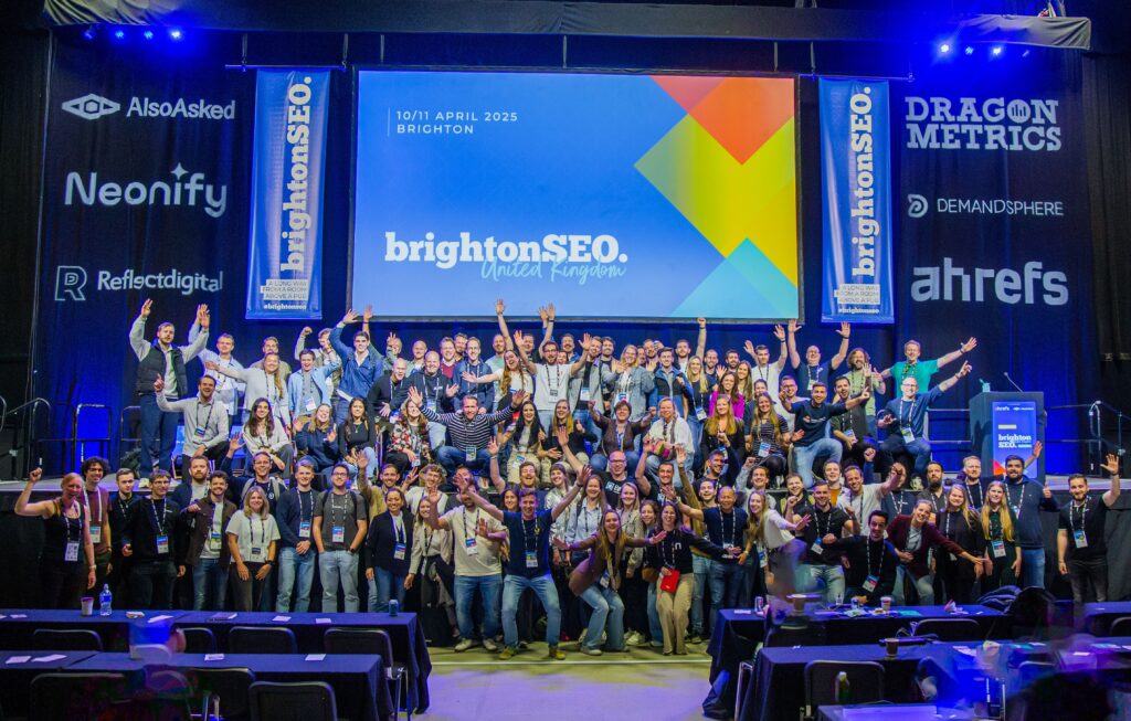
BrightonSEO 2026 Takeaways
Square In The Air’s Junior Account Manager Charles Orchard looks back at the recent BrightonSEO Conference and reveals his four biggest learnings from the south coast… BrightonSEO has always been...
Read More
14/05/2026
|
Blogs
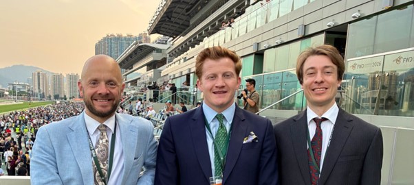
B2C Diary April 2026
SITA's B2C team were in action from Hong Kong, Ireland as well as closer to home in April. Shoe-venir from Hong Kong PR Director Tom Marriott reports from a week...
Read More
14/05/2026
|
Blogs
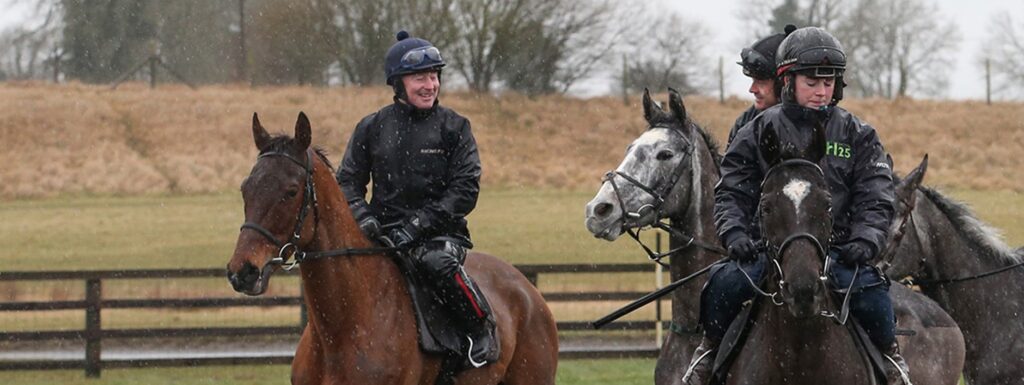
Case Study: Horse Racing Digital PR
March and April are particularly busy months in the National Hunt racing calendar, and in this period Square In The Air oversaw two digital PR campaigns. With the Cheltenham Festival...
Read More
Get in touch
to find out more!
hello@squareintheair.com


