Blogs
The Psychology of Logo Design

Our graphic designer, Armen Olivar, explores the psychology behind logo design and how it shapes emotions and influences audience decision-making.
Logo Design
Have you ever noticed how a logo makes you feel or changes how you see a brand? The shapes, colours and fonts in a logo can have a big impact on our emotions and how we connect with a brand.
Logos are a key part of a brand’s identity. They help people remember the brand and stand out from the competition. Even though they may look simple, each design involves a lot of thought and planning — something our team puts great care into.
Think about the Coca-Cola logo. Does it make you feel excited? Or the Nike swoosh — does it give you a sense of energy or strength? These reactions aren’t random. They come from smart design choices that connect with how we naturally think and feel.
Our brains are built to spot patterns and create memories. That’s why visual elements in a logo can trigger emotions and shape the way we see a brand.
Shape
Circle – Represents unity, wholeness and continuity. Often linked with stability and community.
Rectangle – Suggests strength, reliability and trust — commonly associated with secure, familiar structures like homes and boxes.
Square – Conveys structure, balance and professionalism. Works well for brands in finance, tech or security.
Triangle – Represents energy, precision and power. Meaning depends on orientation:
– Pointing upwards: growth, stability, masculinity
– Pointing downwards: focus, femininity
– Pointing right: forward motion, progress
– Pointing left: reflection
Horizontal lines – Give a calm and grounded impression. Help soften bold or intense designs.
Vertical lines – Suggest strength, progress and reliability.
Organic shapes – Inspired by nature, these forms feel familiar and adaptable. They reflect personality and evoke emotional connection.
Abstract shapes – Often used to tell a story or evoke a mood. Their clean and modern look sparks curiosity and stands out.
Symbolic shapes – Use widely recognised symbols like hearts, stars or crosses, each carrying familiar meaning.
Curves – Associated with rhythm, movement and positivity. Their flowing nature suggests happiness and creativity.
*figure 1
Colour
Red – Passion, excitement, energy
Blue – Trust, calm, professionalism
Green – Growth, health, nature
Yellow – Optimism, cheerfulness, warmth
Orange – Creativity, courage, friendliness
Purple – Luxury, imagination, mystery
*figure 2
Type
Serif – Classic and trustworthy. Often used by premium or heritage brands.
Sans Serif – Clean, modern and minimal. Suited to brands that value clarity and function.
Script – Elegant and decorative. Suggests creativity, playfulness and warmth.
Slab Serif – Bold and confident. Gives a sense of strength and reliability.
Decorative – Custom and expressive. These fonts help show off your brand’s personality.
*figure 3
Font
Light – Soft and delicate
Medium – Balanced and easy to read
Bold – Strong, confident and attention-grabbing
Italic – Suggests motion, speed and forward thinking.
Conclusion
When creating a logo and visual identity, it’s important to understand how shapes, colours and fonts influence people’s emotions. A great logo doesn’t just look good — it should also make people feel something that aligns with your brand.
Our process starts with a kick-off call where we learn about your brand’s goals, values and target audience. We also explore what you want your logo to communicate.
By the end of that first conversation, we’ll have a clear direction and a strong foundation for building a brand identity that truly fits who you are.
Ready to Level Up Your Logo?
Is your logo in need of a refresh? Falling behind in a competitive industry? Our expert design team is ready to help you stand out. Get in touch at hello@squareintheair.com to learn how we can transform your logo and brand to capture attention and drive results.
Other recent articles you may be interested in...
19/05/2026
|
Blogs
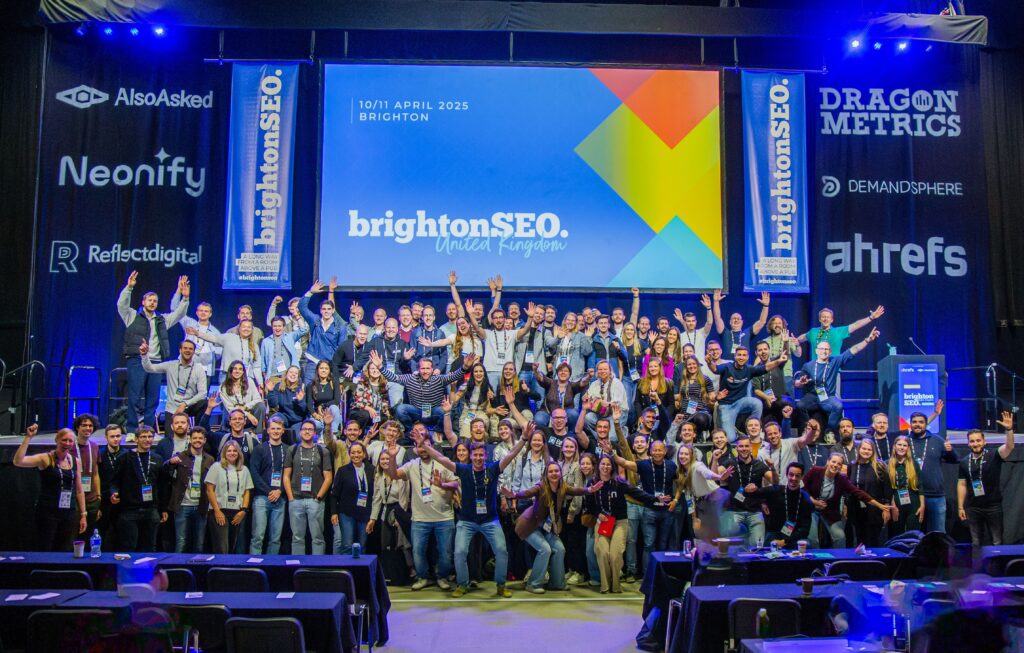
BrightonSEO 2026 Takeaways
Square In The Air’s Junior Account Manager Charles Orchard looks back at the recent BrightonSEO Conference and reveals his four biggest learnings from the south coast… BrightonSEO has always been...
Read More
14/05/2026
|
Blogs
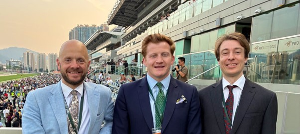
B2C Diary April 2026
SITA's B2C team were in action from Hong Kong, Ireland as well as closer to home in April. Shoe-venir from Hong Kong PR Director Tom Marriott reports from a week...
Read More
14/05/2026
|
Blogs
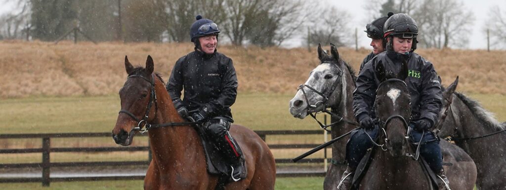
Case Study: Horse Racing Digital PR
March and April are particularly busy months in the National Hunt racing calendar, and in this period Square In The Air oversaw two digital PR campaigns. With the Cheltenham Festival...
Read More
Get in touch
to find out more!
hello@squareintheair.com


