Case Studies
DEVELOPING THE BETFORGE BRAND ECOSYSTEM
Overview
The goal was to craft a bold and innovative parent brand that embodies intelligence, trust, and agility within the industry. Alongside this, we designed a cohesive brand framework adaptable to specialised domains such as data performance, gaming experience, and payment management.
Brand Profiles
BetForge — A forward-thinking incubator in the iGaming and payments space, delivering AI-driven insights and behavioral data solutions that boost retention, loyalty, and lifetime value.
SightRush — A data-platform-as-a-service built for powering machine learning workflows, analytics pipelines, and advanced visualisation tools.
GamePark — An AI-powered platform that creates personalised and engaging gaming experiences, whilst balancing individual player preferences with commercial KPIs, including payout optimisation.
PayLab — A payment orchestration and reconciliation platform providing seamless access to an extensive PSP network as well as delivering a fully automated solution to simplify payment management worldwide.
Branding & Industry Positioning
From the outset, our designers set out to create a distinctive and future-focused identity for BetForge, whilst reflecting leadership through their AI-driven innovations. The brand system used shared visual cues such as typography, structure, and design principles to ensure recognition and unity. At the same time, differentiation was introduced through color palettes, creative direction, and tailored messaging to give each sub-brand a unique presence within the ecosystem.
Creative Direction & Brand Guidelines
After finalising the logo, we developed a comprehensive stylescape and digital asset kit to establish the brand’s creative foundation. Designed for ease of adoption, the kit outlined clear standards for logo usage, typography hierarchy, colour application, and asset implementation. It also included application examples to guide consistent use across digital platforms and marketing materials. By defining these principles early, we ensured the brand could maintain a cohesive visual identity while remaining adaptable for future growth.
Logo Animation
As a key component for the brand, we created a bespoke logo animation that had multi-purpose use across social channels, video content, and conference stand marketing. The aim of this was to create an impactful, timeless asset that not only reinforced brand recognition but also elevated the overall visual identity. Its dynamic yet refined execution conveyed innovation, professionalism, and confidence — qualities that align directly with the brand’s core values and long-term vision.
Looking to develop your brand?
We offer the following services and more!
- Brand Identity Creation
- Creative Strategy & Positioning
- Brand Guidelines
- Logo Animation
Please get in touch with our design team design@squareintheair.com for more information.
Other recent articles you may be interested in...
26/08/2025
|
Case Studies
Codere Sponsorship Comms
Overview Square in the Air supported this high-profile partnership through targeted B2B, Design and Social communications that reinforced Codere Online’s position as a leading operator. B2B We assisted in the...
Read More
09/07/2025
|
Case Studies
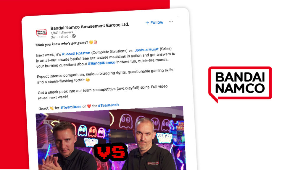
Bandai Namco Amusement Europe
The Mission Promote BNAE's pioneering role as a prominent amusement supplier and innovator in global entertainment. Our strategy focused on leveraging its extensive brand strength across B2B social media, industry...
Read More

30/06/2025
|
Case Studies
Hong Kong Jockey Club Creative Direction
Brief To create marketing materials to advertise Hong Kong racing to a UK audience in leading print publications such as Racing Post and CityAM and via their social media channels....
Read More
Get in touch
to find out more!
hello@squareintheair.com


