Case Studies
OCHE180 CREATIVE DIRECTION WEB
Our design team was tasked with developing a brand identity and website design for a darts journalism company with over 30 years of award-winning coverage in the sport.
Overview
Our goal was to guide the Oche 180 brand into an exciting new era. To do this, we focused on refreshing and modernising the brand identity and website to boost impact, enhance recognition, and increase web traffic. As part of this rebrand, we crafted a new logo, developed detailed brand guidelines, and established a fresh creative direction.
About Oche180
Oche 180 is a specialist darts journalism company with over 30 years of award-winning coverage in the sport. Led by renowned journalist Phil Lanning, Oche 180 delivers in-depth interviews and insightful features on darts players and events worldwide.
Meeting with the Client
During our initial meeting with the client, we explored some of the challenges they were facing with their existing branding. One of the most prominent issues was that the logo didn’t feature the full brand name — a missed opportunity for building stronger brand recognition. Additionally, the old logo was overly intricate, which made it difficult to read and recognise at smaller sizes.
We then discussed what the client hoped to achieve with the new design. His requests were clear:
- The logo should include the full name, “Oche 180”, not just “Oche”.
- It needed to be versatile and recognisable even at smaller scales, such as on social media icons.
- The design should feel clean, minimal, and modern.
- It had to possess a timeless quality, ensuring the brand remains relevant for years to come.

Logo Design
We designed a simple, clean, and modern icon, using a hexagon as the primary shape to reflect the shape of a dart’s flight. We also incorporated three dart tips using negative space, all directing at a single point to represent precision and accuracy. Additionally, the icon points to the right, symbolising innovation and forward progress. The icon remains clear and identifiable even when scaled down, making it perfect for use on social media.
We chose an italic font for the wordmark logo to convey a sense of motion and speed, perfectly aligning with the dynamic theme of darts.
Brand Guidelines
To ensure a consistent and cohesive brand identity moving forward, we compiled a comprehensive set of brand guidelines. These covered everything from logo usage and typography styling to a curated colour palette and the appropriate application of graphic assets.
Website Redesign
The aim of the website refresh was to deliver a modern, visually engaging experience for visitors. We achieved this by incorporating smooth carousel sliders, a newsletter subscription call-to-action, and subtle design touches — such as gradients and brand assets drawn from the new logo.
One of the most striking updates was moving from a traditional white background to a sophisticated dark mode — a change the client was especially excited about. To add vibrancy, we wove accents of purple throughout the design, appearing in text highlights, underlines, and various UI elements, reinforcing the new brand aesthetic.
Visit the website here!
Ready to Level Up Your Brand?
Is your brand in need of a refresh? Falling behind in a competitive industry? Our expert design team is ready to help you stand out. Get in touch to learn how we can transform your brand and digital presence to capture attention and drive results.
Other recent articles you may be interested in...

25/06/2026
|
Case Studies
Abelson Sports: Crafting a growth narrat...
Abelson Sports first engaged Square in the Air following the launch of its new branding at the start of last year. As one of the industry’s most established providers of...
Read More
13/05/2026
|
Case Studies
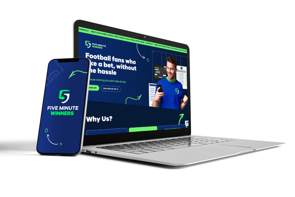
Five Minute Winners Brand Development &#...
The Brief After operating successfully for more than eight years through a subscription-based mailer platform and a loyal niche audience, Five Minute Winners approached us to lead a complete brand...
Read More
09/04/2026
|
Case Studies
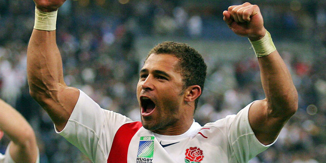
CASE STUDY: Jason Robinson Six Nations c...
Square in the Air were tasked with running a digital PR campaign for one of our clients during the Six Nations. An annual rugby union tournament, the 2026 edition was...
Read More
Get in touch
to find out more!
hello@squareintheair.com


