Case Studies
Tech Vault Brand Identity
The best kept secret in Vermont. Tech Vault provides Data Center Co-location, Cloud Services, Disaster Recovery, Storage, Security, and Consulting Services for all sized businesses in the state of Vermont.
Overview
We were tasked by the team at Tech Vault to create a trust-worthy, modern, personable and customer-focused brand that stands out within a crowded marketplace. This included a new visual identity, brand guidelines and sales deck to utilise across all their marketing comms.
About Tech Vault
As the only commercial class data point in Vermont, their aim was to bring industry leading expertise to local/rural communities by targeting a definitive geographical pocket of people, close to home.
This gave them leverage in geographical areas where there were no direct competitors or restrictions in surrounding states.
Logo Design
Previously, their logo used a vault shape with two different gradients making it illegible in smaller formats and causing colour clashes on different backgrounds. This demonstrated it was out of sync with current design trends and needed a complete refresh.
We began the ideation process by looking at modern sans serif fonts and visual cues that would still relate to the idea of security, but demonstrating it in a refined form.
We explored a variety of different colour combinations to come away from different shades of blues that was overused by other competitors within the market. We then set on a colour palette that utilised different shades of green to link back to the surrounding area of Vermont where the company is primarily located.
Brand Guidelines
We created a 20-page Brand Guideline document that focused on the following:
- Primary & Secondary Logo’s
- Logo Application & Usage
- Type Hierarchy
- Colour Ratio and Application
- Brand Environment (Imagery and Collateral)
This enabled the brand to follow a consistent look and feel across all their marketing materials to enhance brand recognition and engagement.
The Result
If you’re a brand is in need of a refresh – we’d love to hear from you!
- Primary Secondary Logo’s
- Logo Application Usage
- Type Hierarchy
- Colour Ratio and Application
- Brand Environment (Imagery and Collateral)
Other recent articles you may be interested in...

25/06/2026
|
Case Studies
Abelson Sports: Crafting a growth narrat...
Abelson Sports first engaged Square in the Air following the launch of its new branding at the start of last year. As one of the industry’s most established providers of...
Read More
13/05/2026
|
Case Studies
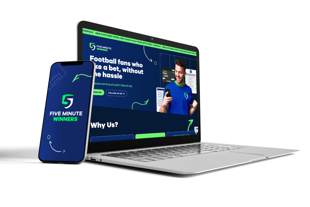
Five Minute Winners Brand Development &#...
The Brief After operating successfully for more than eight years through a subscription-based mailer platform and a loyal niche audience, Five Minute Winners approached us to lead a complete brand...
Read More
09/04/2026
|
Case Studies
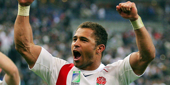
CASE STUDY: Jason Robinson Six Nations c...
Square in the Air were tasked with running a digital PR campaign for one of our clients during the Six Nations. An annual rugby union tournament, the 2026 edition was...
Read More
Get in touch
to find out more!
hello@squareintheair.com


